
Student & Instructor Experiences
Sample of UX work on SimSpace's cybersecurity training platform.
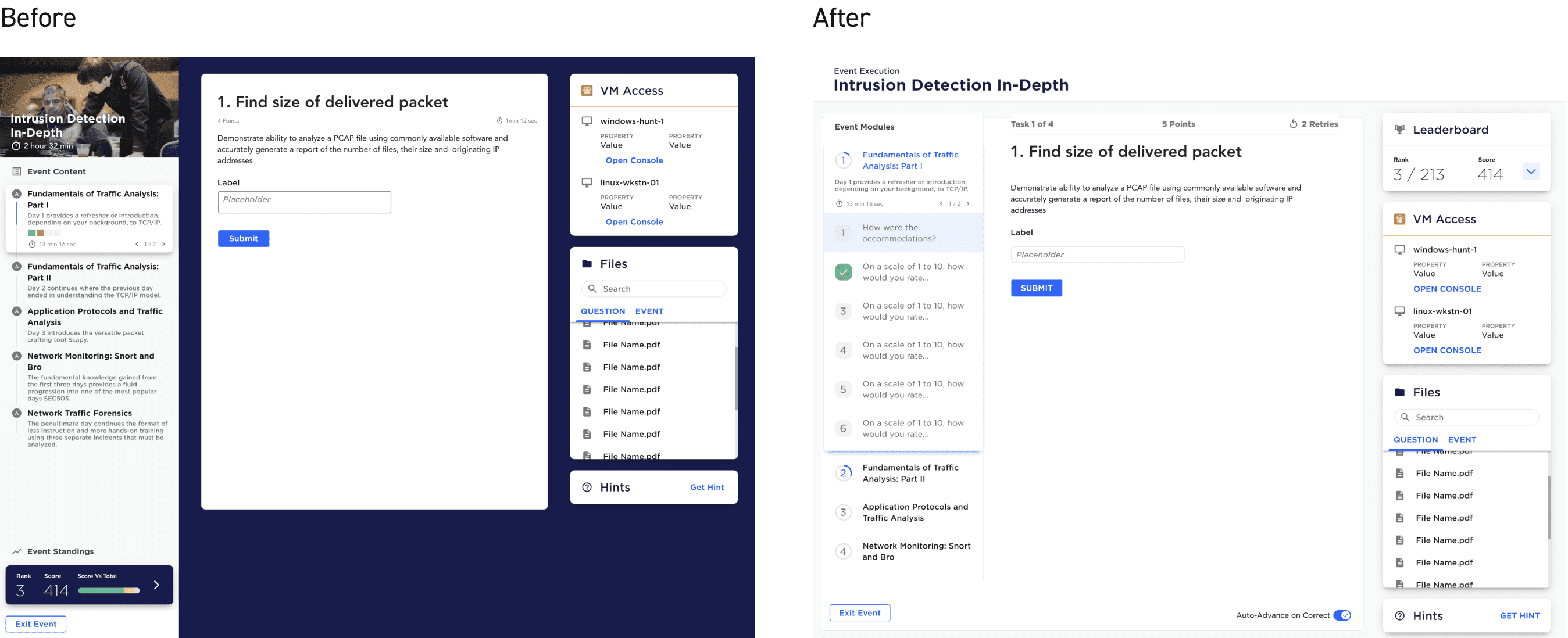
Three pain points, one light interface.
The student interface redesign addressed three key pain points: a high-contrast dark/light hybrid that created visual inconsistency, a distracting hero image that served no purpose during active testing, and tiny navigation "chiclets" that made it difficult for students to jump between questions. The solution introduced a fully light interface, removed unnecessary imagery, and enlarged the question navigation with clear titles — providing larger click targets and better context.
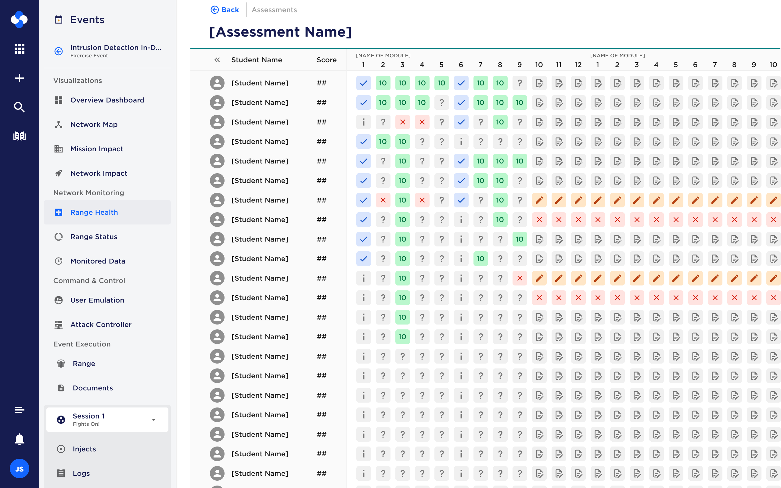
Real-time visibility without a wall of noise.
The assessment monitoring matrix was designed to give instructors real-time visibility into student performance during tests, enabling them to identify struggling students who needed help, spot patterns indicating issues with questions or VMs, or flag unusually high performers for potential cheating. The data-dense interface used iconography to represent different question states (unanswered, correct, awaiting grading), with interactive popovers revealing detailed performance data when clicking on students, tasks, or individual responses. Color reinforced information visible through iconography rather than serving as the sole indicator, ensuring accessibility compliance.
A two-year-old component, redesigned to scale.
The training card redesign addressed a component that had been in production for two years but no longer met the platform's needs as more data was required within each card. The original design had accessibility issues, usability confusion, and inconsistent branding. The redesign improved hierarchy and readability, introduced visual difficulty indicators for better comprehension at a glance, and created a more scalable solution. As a generic component used across multiple parts of the platform — training catalogs, user dashboards, and ongoing projects — this redesign demonstrated how iteration on the design system could have exponential impact across products.
