Real-Time Network Monitoring
View status and activity of cyber ranges.
Multiple data streams, one glance.
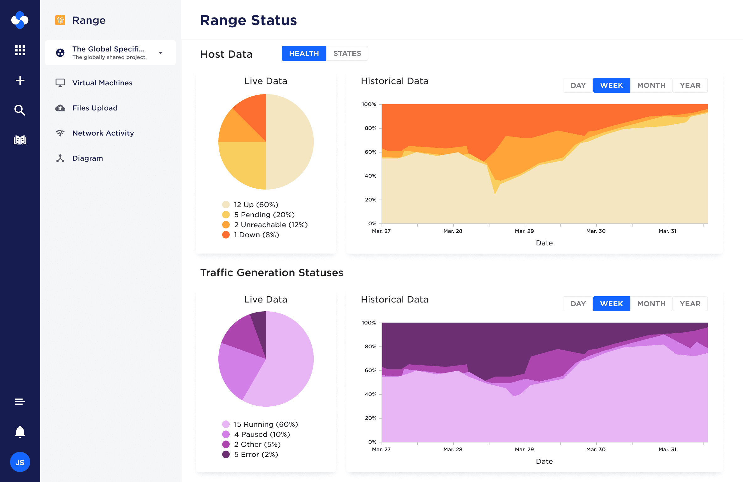
The Range Status dashboard gave proctors a live view of network and virtual machine health, combining pie charts for at-a-glance status breakdowns with historical trend charts to show how the range was performing over time. The challenge was representing multiple data streams simultaneously without overwhelming the viewer.
From raw log dump to structured, branded tool.
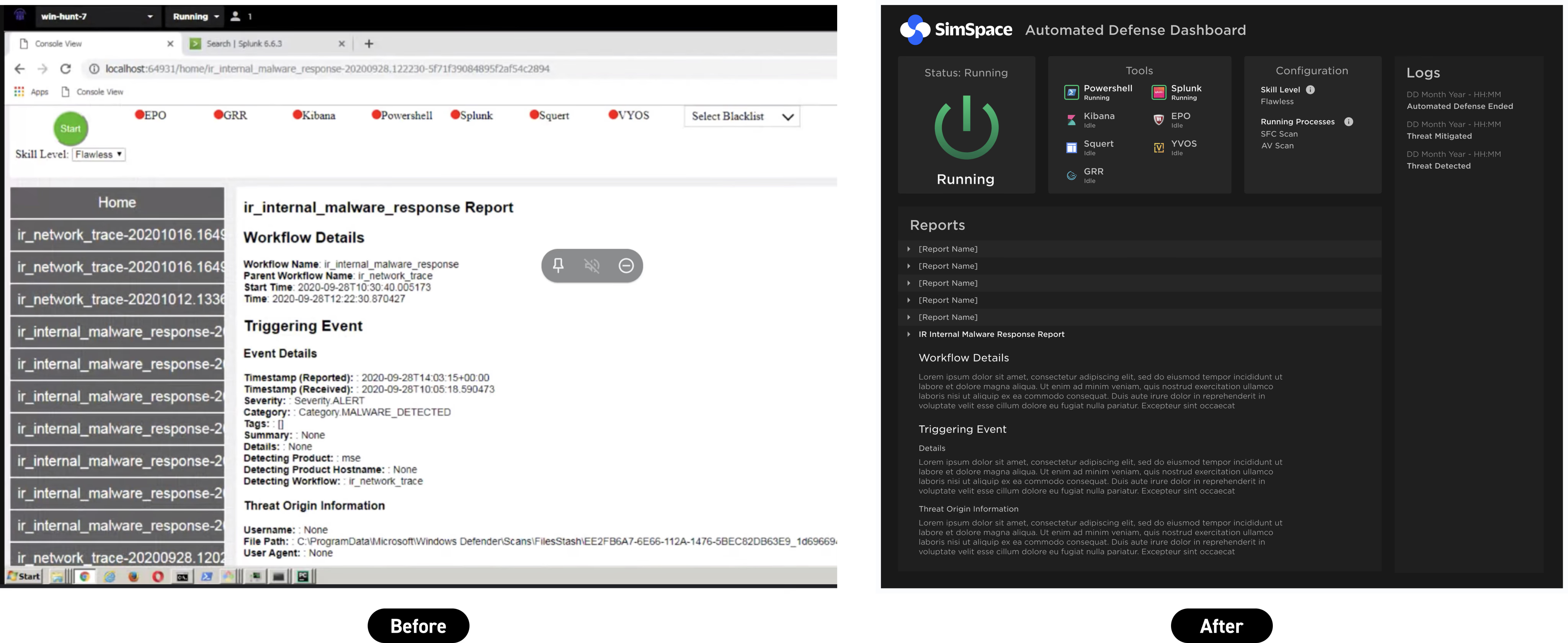
The Automated Defense Dashboard was designed around a before/after opportunity: the existing "interface" was essentially a raw log dump with no visual hierarchy or branding. The redesign introduced clear structure, status indicators for the defensive AI and its tools, a log feed, and expandable reports — bringing transparency and brand consistency to a tool that previously offered neither.
Spatial status, beyond tables and lists.
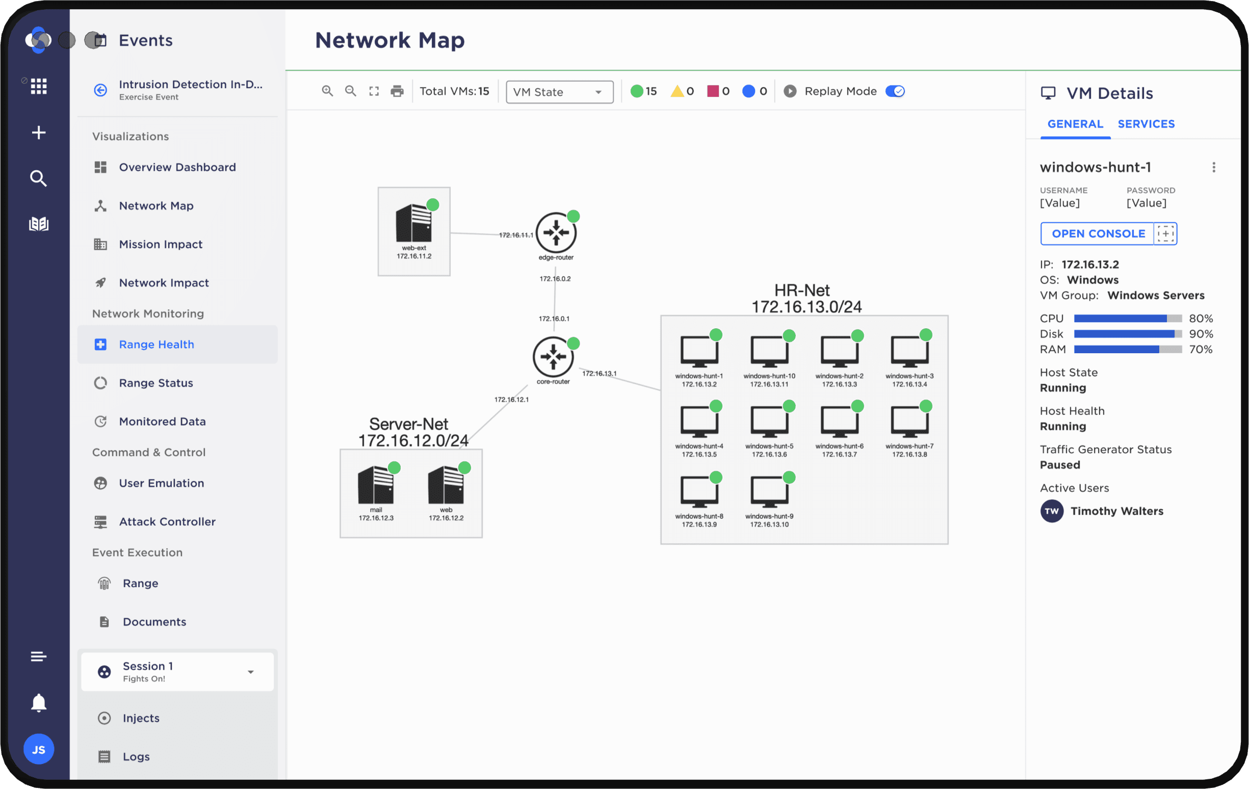
The Network Map provided a spatial view of virtual machines across the range, allowing proctors to see the state of individual hosts, active users, and resource usage at a glance. Designing a diagram-based interface required moving beyond table and list conventions to represent relationships and status spatially while preserving interaction patterns via a toolbar and detail panels.