NBCU Enterprise Design System
Multiframework design system for internal products.
One system, meeting every framework where it lives.
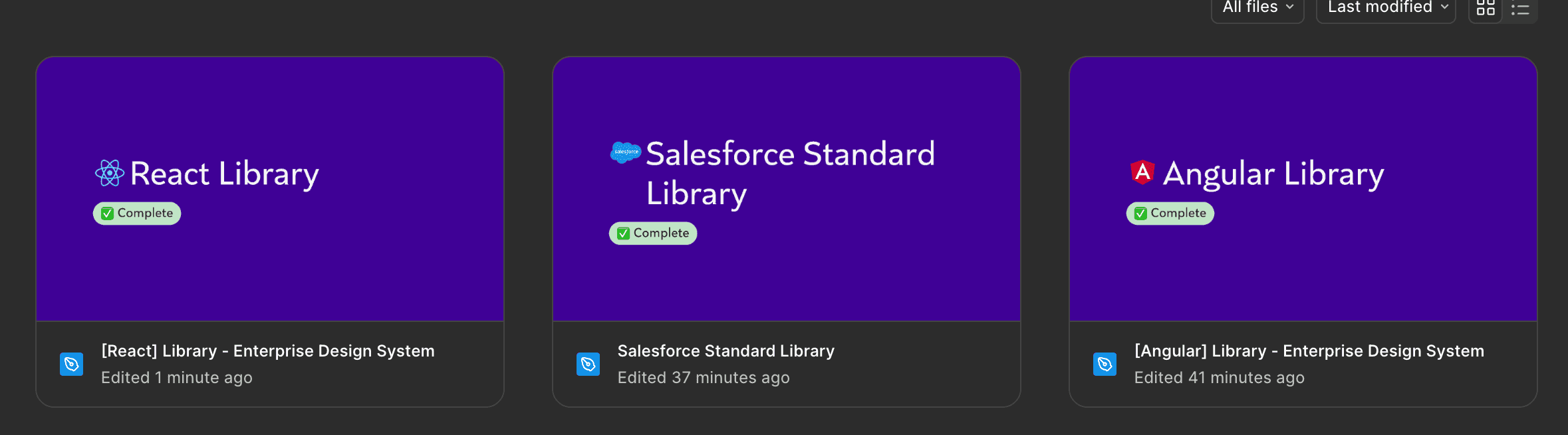
The component libraries were built or co-built across several frameworks — React, Angular, Salesforce, ServiceNow, SAP, SharePoint, and Shad/cn for AI products — to serve designers working across a diverse enterprise product landscape. Rather than building a single custom system, maintaining separate framework-aligned libraries meant meeting development teams where they already were. Staying within each framework's constraints reduced the friction of adoption and accelerated the design system's reach across more products.
Full-page templates, configurable instead of custom.
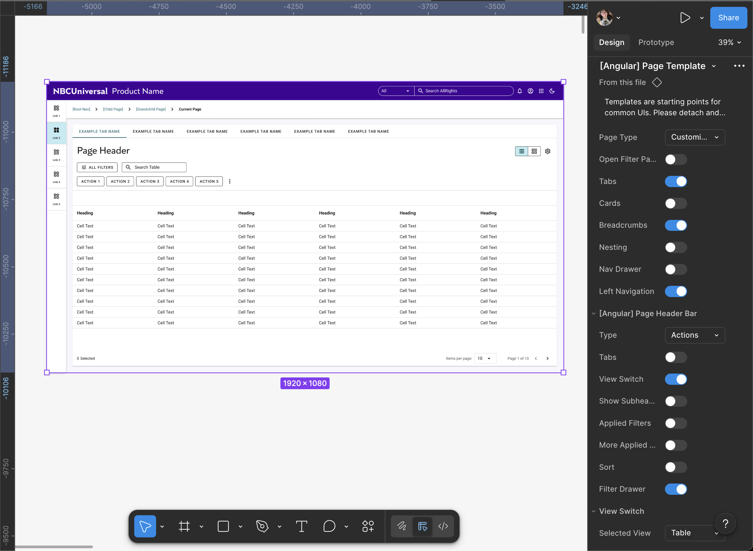
The page templates — covering common patterns like tables and forms — were designed to be highly configurable within Figma, with toggleable properties that allowed designers to tailor layouts without diverging from the system. This reduced variation across products and saved significant time, while giving the system enough flexibility to handle a wide range of use cases. Pushing for these templates to also be available in FigJam extended their reach to product managers and developers earlier in the workflow, reducing the gap between ideation and implementation. This was part of a broader move toward self-service tooling, which also included a custom Figma plugin for generating table configurations.
Documentation as the system's reach multiplier.
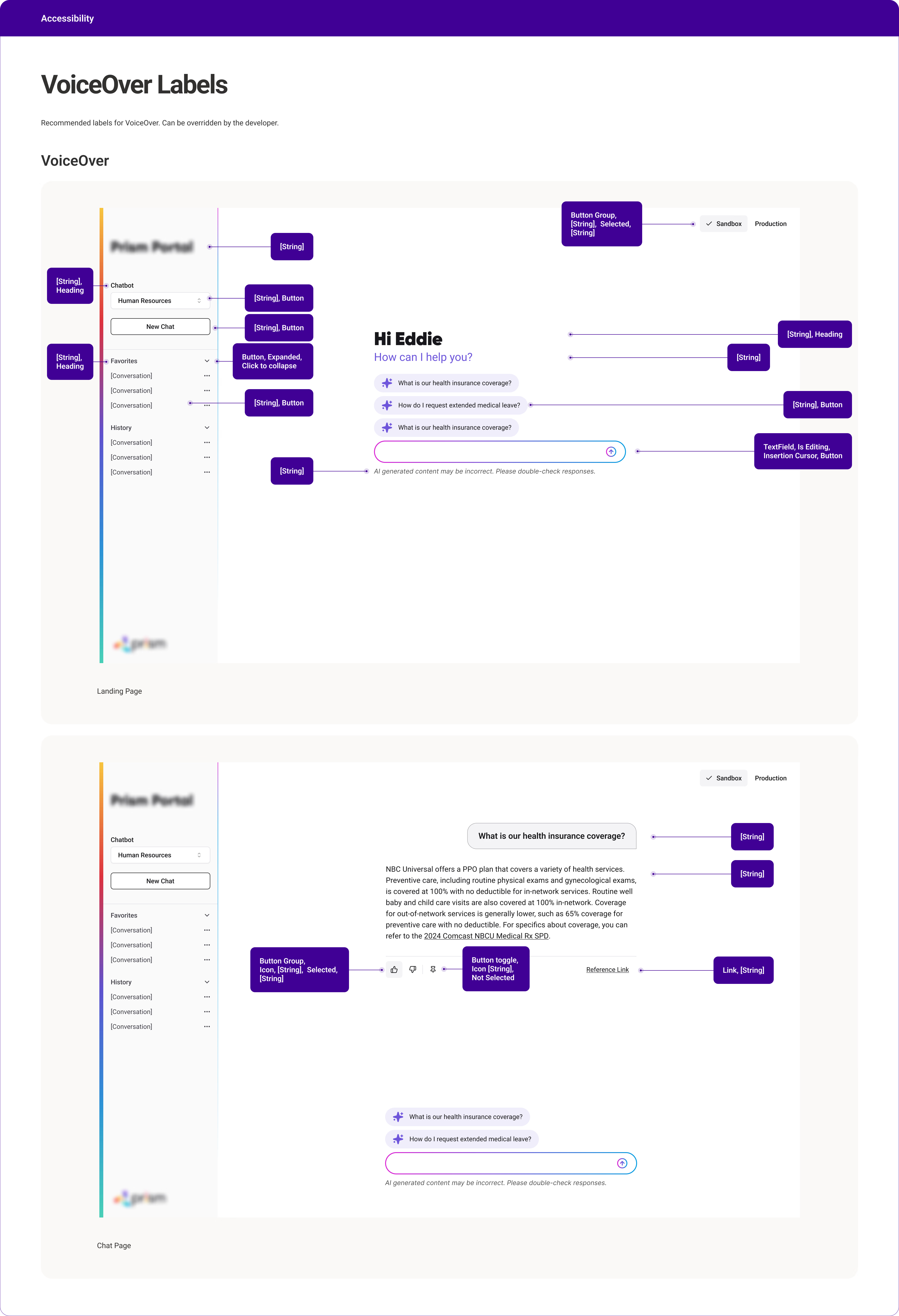
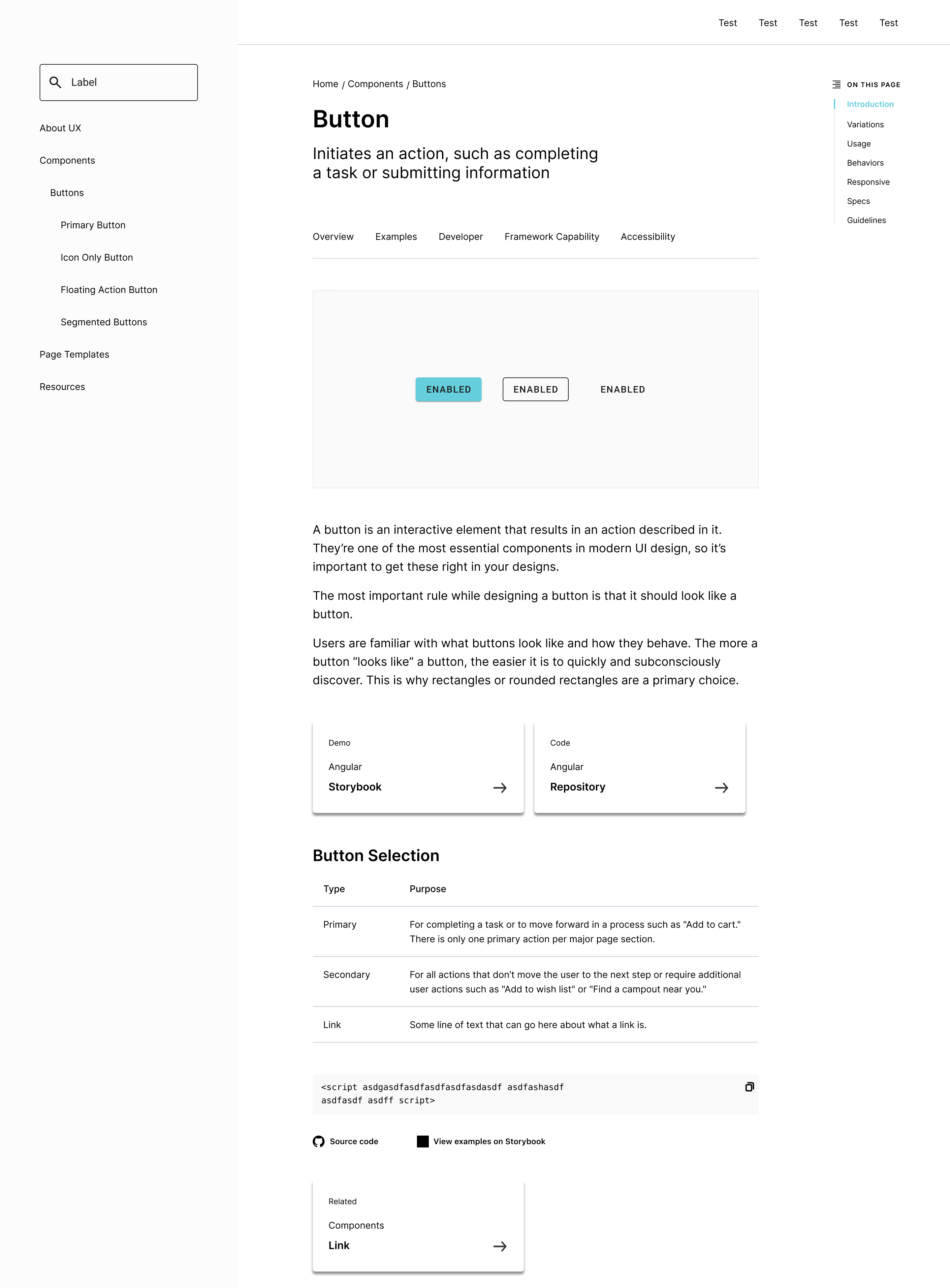
Documentation standards were a core part of scaling the system's impact — covering component documentation, design-to-development handoff specs, guidance for other designers, and accessibility annotations. Standardized accessibility templates in particular became a strategic priority as organizational leadership placed increasing focus on compliance, documenting VoiceOver labels, tab order, and screen reader behavior to give developers clear, actionable specs. Having consistent documentation across all of these areas meant the system could function as a reliable reference for teams working without dedicated design support.